1. What were you expectations for this course and where they met?
Starting this course I expected it to be challenging but rewarding, and this is exactly what the course ended up being. The course is very demanding, but it is an online course so that was expected. However the projects stirred up ideas in me and kept things interesting.
2. Now that you've been through this course, What is art? How would you define it now compared to your intial posting?
My definition of art in my first posting still holds true at this point. I had said I defined art as something visually appealing but that it could mean different things to every viewer and that not all people were going to like it. I still stand by my definition and I feel that this course has even proved my definition even further.
3. Who was your favorite artist in your original posting and who is your favorite visual artist now? If there is a difference, why do you think so? If you have the same favorite artist, why do you think so?
I am still unsure about who my favorite artist is! I still like the Renaissance and particularily Jan van Eyck, however now I have been introduced to more art and now like lots of things instead of just a few favorites!
4. Now that you've completed this course, how do you feel about taking an online course? Is your answer the same as it was in your first posting? How is it the same or different?
As I said in my first posting, online courses are demanding, but that is expected since there is no designated class time to get things done in. Online courses make it easy to gain credits though, especially if you work full time in the summer and can't go to a class on campus, or if you want to take 6 classes during the semester but don't have time to go to all on campus.
Thursday, August 11, 2011
Critique Blog
1. Which projects did you review?
I reviewed Katie Lynn Raiser's "The Feeling it Brings"
2. Why did you select the Exhibit you critiqued?
I looked at almost ten exhibits and this is the one I felt I could connect with the most, and that was the most interesting to me because I could understand fully what it was about. There were many exhibits that I didn't understand the concept of their theme and just felt lost looking through the exhibit, but Katie's was not like that at all.
3. What challenges did you face in writing the critique article and how did you overcome them?
I had a hard time critiquing the exhibit in general because I enjoyed it a lot. I don't like to hurt people's feelings so I didn't want to be mean about anything. I would be a terrible critic! I overcame this by focusing on the good things and just offering a little advice about things that I was confused on.
4. How do you feel about critiquing your peers work?
It is interesting, but like I said I don't want to hurt anyone's feelings so I have a hard time finding the right things to say.
5. Would you like to read the critique your peers wrote about your Art Curation Project?
Yes of course, I am always intersted in what others have to say about my work. I would be nervous though that someone might say something rude.
6. On a scale of 1-10 how would you rate your finished article and why?
I would rate it an 8, I think I did pretty well I am proud of it but because I am not a rude person I think it lacks character that other critic's work has.
7. Did you enjoy working on this project?
I enjoyed this project, it was very time consuming but that is understandable since it is such a large portion of our grade. It was interesting and has kept me on my toes the entire time.
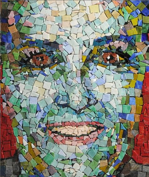
Self Portrait
I chose these three pieces for insipration because after looking at many self portraits, I liked that even though these were abstract and distorted, you could still tell who the person was. Growing up I never liked getting my picture taken, I am a lot better about that now, but I decided to still draw upon that feeling and create a self portrait that distorted the image of me so I could in a way hide, but it could still be recognized as me. I created my self portrait using digital media because I am working overtime this week so I didn't have much extra time to create a painting, but I have access to a computer all day and was able to work on it during my breaks. I took a picture of myself, and then used a program to edit and apply many filters to it until I had a final image I was pleased with. This took a little while because I thought I had a final image many times but then decided to start over again and do different things to the image. I ended up with a few final images and then chose one to be the image for this project. I think this piece represents me because I am a shy person, so the distortion gives me a screen to hide behind. Also the piece is colorful, and I am a lively person so I feel it captures my spirit. The elements of color and texture are the most obvious in my portrait, but I also believe that line makes an appearance as well just not in such a blatently obvious way; it has been distorted. I thought this project was fun, it was difficult to decide what I wanted to do at first, but I found great examples to inspire me. My ideas kept changing, but they were progressive changes that led me to my final product. I am very happy with my self portrait, I would consider doing this project again in the future, there are so many possibilities!

 |
| Peter Fox Big Self Portrait 2009 acrylic on canvas |
 |
| Laura K Aiken Self Portrait 2009 |
 |
| Chuck Close Self-Portrait 1999 |
 |
| Emily Krolewicz Self Portrait 2011 |

Wednesday, August 10, 2011
week 11 videos
Greenber on Art Criticism- This video compared art and music criticism, I found it very interesting and learned that it is easier to interpret music because the artists feelings seem to radiate from the song itself, whereas with art you have to interpret it on your own subjectively. This is helpful to the art criticism project because it teaches me that I have to do more than just look at the art, I have to search for the meaning or aspects that are interesting.
Renaissance- This video talked about how artists in the renaissance developed as they did because they studied the artists that were great before them and learned from them. This is helpful to our portrait project because we can draw insipration from artists for our self portrait.
Jackson Pollock- This video talked about Pollock's work and how he was a master painter, but also how his art shows a low point in modern art. This video showed exactly how art criticism works, some people might think one thing, while others think the opposite. This was helpful to our project in showing how critics have viewed things in the past.
Sunday, August 7, 2011
Art Curation Project reflection
This project was fun but challenging. I knew what I wanted to right away (More than Meets the Eye), but was having trouble finding images that were cohesive and also enough images. The idea came from a project I did in high school where we used words of emotion that described a picture to create value, by overlapping the words. I had the idea that from far away it looks like just another picture, but as you get closer and see that there is text and read it, you get a different feeling for the work and get involved in the emotions and have a new connection with the work. I wanted to find more images out there like mine at home to show how we see images all the time in life, but how artists can make those images about more than what we just see on the surface.
I found enough pictures for the project, but realized there would be no cohesion in my exhibit and that viewers would get bored. I brought this to attention in the discussion forum, and Professor Tabone suggested that I find images of similar nature to compare my chosen images to. This idea was great and I think by using it I created a new interest in my piece. Instead of just being a jumble of images with a similar background, it became more of a challenge to viewers to see the differences and compare and relate them to their own lives and take what they could from it.
I think my exhibit turned out really well. It took a long time to put it together, but the final result is good I think. I chose a gallery space that was wide open so it would allow a maximum amount of viewers to see each section but not be over crowded. The walls are divided into niches, in which each pair of images would go, side by side so viewers could compare. I think this will have a great effect, since each pairing will be essentially in its own little world.
Although this project was challenging, I had a fun trying to complete it. I can't imagine how difficult it must be to put together an exhibit in real life. I'm not sure I want to find out either, I was stressed just trying to complete a power point exhibit! I have a new appreciation for art exhibits and won't just look at them as paintings on walls anymore, but will be able to view the gallery as an entire space created with purpose.
Wednesday, August 3, 2011
Curation videos
Lowdown: This video was about the style called "lowbrow" which is art that is "lacking in taste". I thought of art like this to be sort of like the urinal we saw in the last set of chapters, hard to consider it art. As you look further into it and learn more though the pieces begin to stand out as art because you have a better sense of it. Some people who like this style say they find it easier to relate to than traditional art, I think this is probably because they sometimes have everyday relateable objects in them, or are made my people they can relate to better than an 18th century painter.
Modern Art: This video showed how the art of displaying art evolved and how art came off the walls at a certain point and actually into the viewers plane. It talked about how the Tate museum organizes the art in their galleries in ways that would be interesting to the viewer, as in sticking a piece somewhere it doesn't seem to fit, so it would catch the viewers attention.
Contention: This video talked about how if a Native American body is found, historians study the remains to learn about their people, whereas if a caucasian body was found they would just bury it. It ended saying that many native American bodies are now being returned to their families instead of being picked over by scientists. I don't think this was really related to art, however it was very interesting and made me question many things.
Eastman: This video was about George Eastman who was considered to have started photography. They went inside his house which is now a museum and talked about all the original pieces there. I was surprised to know that they had 140,000 pictures from his collection online.
The video that helped me the most with this curation project was Modern Art, because it gave me new ideas of ways to organize an exhibit. I never though about all the work that goes into galleries before, I have a new appreciation for it now. Also the video about the lowbrow style was helpful because it shed light on how different types of work can be considered art to many.
Saturday, July 30, 2011
postmodern videos
Andy Warhol- I chose this video because he is a very popular artist, and I am familiar with his work. My uncle went to the Warhol museum and said once that Warhol was very messed up and he didn't like his artworks, so I wanted to learn more about Warhol and see for myself what I think about him. The video didn't really show him as being too nuts, so I decided that I still like him, unlike my uncle. The most interesting part for me was about how he made a lot of screen prints, because I am currently in the middle of screen printing here at home and it gives me inspiration.
Hockney- I had never heard of this artist before, but I enjoy photography so I decided to give him a shot. I really enjoyed the video and learning about the collages Hockney made out of poloroids. I find poloroids to be very classic and I love the way he put the piece together. I liked that this video concentrated on the artist and his process', I haven't seen that in many of the videos I have been watching this summer (maybe I have been choosing the wrong ones!).
Both the videos make the information in the book moer concrete in my mind. The end.
modern world videos
Dada and Surrealism- I chose this video because I find the Dada style very interesting...and sometimes strange. I wanted to learn more about it. I know of the artist Salvador Dali, so it was interesting getting to learn more about his works. Also I found it very interesting to learn about surrealism. I have completely looked over surrealism in the past, and now have a new appreciation for it because of its psychological background.
Expressionism- I don't know much about later styles of art, I have focused mainly on the renaissance in the past, so I wanted to explore styles such as Expressionism. I found the style a little confusing still, as the video taught me that this style uses color instead of perfection to represent something, and that it aims to show a sensation or feeling.
These videos reinforced what was in the book...as always.
Sunday, July 24, 2011
Mask
 I was first drawn to this Batak mask from the Dutch East Indies, I like the elongated face that was created. I think the point of the mask is already to be someone you are not and so elongating that face into an even more abstract representation makes the effect even more impressive. I also like the playfulness of the faces, and the exaggerated features.
 My second inspiration is the Fang mask used in ceremony searching for sorcerers, again I like the elongated face and on this one I like the lack of facial features. It is simple and pleasing.
 My last inspiration piece is the "Kifwebe" mask from the Songye people in Zaire. This is a mask described as portraying an dangerous force, and I like the simplicity of it. I like the geometric patterns the African people have used on their masks, seen on this and many others.

The mask I created is made out of clay that I let air harden and then painted an earth brown color. I wanted my mask to be completely 3D so I made a mini model of what a full version would look like, since I didn't have enough clay to make a life-size model.
My mask is a mix between all of my inspiration pieces. I wanted to use simple geometric forms and balance them on an enlongated face, but also keep the "dangerous force" aspect. My mask I think would be used to ward of bad spirits.
I had fun doing this project because I got to make something with my hands and be creative. Coming up with an idea wasn't very hard, once I got the clay in my hands it all just came together as one piece.
Friday, July 22, 2011
Video reviews week 8
I watched 3 asian videos, “Chinese Art:Treasures of National Palace Museum”, “The Great Wave” and the Buddhism video, as well as the Islamic Art video. I am not really a fan of Chinese art, so I didn’t really get much out of the first video, they have a lot of delicate decorated china, such as the tea bowl in the video. It is beautiful, but doesn’t really interest me. I tried to watch the video to get a greater appreciation for Chinese art. I know of the Japanese work “Great Wave” so I figured I’d watch the video to learn more behind the piece. I learned how the wave is representative of our lives, and especially enjoyed seeing all the places the piece has be reused, such as in comics. From the Buddhism video, I learned about their pilgrimage “Great Stupa”, I never knew Asian religions had Pilgrimages like Christian’s and Islam’s. The Islamic video was quite different from the other three, since it is a completely different culture. I think Islamic art is beautiful, and I appreciated that the video tried to break the barrier between the stereotype of terrorism and their religion. The videos added to this weeks reading by giving me more visual references and personal accounts.
Friday, July 15, 2011
Video review
I watched La Primavera, Leonardo Da Vinci, and Night Watch. I chose these because I am familiar with the two paintings, and spent a semester abroad in Italy so I am also interseted in Da Vinci. I researched La Primavera a lot in a previous class, but through the video I learned even more takes on the painting. Everyone has their own opinion about interpreting art so it is always interesting to hear more takes on it. A surprising thing I learned from Da Vinci was that he performed autopsies....That is strange and interesting, and maybe something I didn't want to know. I wonder if his studies helped perfecting his art at all. I have always been intrigued by Rembrandt's Night Watch because of the extreme chiaroscuro he uses, but I learned how much this painting has been through in vandalism, and as always I am shocked that people would treat someones creation like that...whether or not it was valuable at the time. As always these videos add to the reading by providing visual aids and more in depth insight on specific topics.
Gallery Visit #2
Exhibit
Title: "The Fateful Trip: Burchfeild, Lankes, and Schwanekamp
Theme: This exhibit shows Buffalo in the early 1900's
Gallery
Type of lighting: Track lighting on the ceiling giving natural light to the gallery, lights pointed at the art on the walls
Colors on walls: White/off-white
What materials are used in the interior architecture of the space?: the walls are placed at angles, giving a more artistic feel to the room.
How is the movement of the viewer through the gallery space?: Very open, art is along all of the walls and allows viewers to move through easily.
Artwork
How are the artworks organized?: They are all at eye level, organized by artist.
How are the artworks similar?: They seem to all be nature scenes, both landscapes and people.
How are the artworks different?: They are different styles, sizes, and media.
How are the artworks framed?: They are mostly all in wooden rectangular frames of various colors.
How are the artworks identified and labeled?: There are plaques next to each each artwork with it's information on it.
What is the proximity of the artwork to each other?: They are about 1-3ft apart, smaller pieces are closer and larger are further apart.
Art Criticism

1. Artist: Charles Burchfeild
Title: Genesis
Media: Watercolor, gauche, and charcoal on paper
Date: 1924
This piece shows a scene of stormy looking clouds above a rough seas with mountains. There is a lot of emotion with the dark clouds against the light sky and water. Principles and elements of bold lines and brush strokes, bold colors and contrast are used. This reminds me possible of the creation of earth as described in the christian bible and as the name implies.

2. Artist: J. J. Lankes
Title: Buffalo Harbor (Blackwell Canal)
Media: Wood engraving on paper
Date: 1922
This shows a scene of a boat moving through a body of water next to a large building. It has a very industrial feel to it. The principles and elements of line contrast and shape are used. Before I saw the title, it reminded me of the big boat that used to be docked next to one of the abandoned factories on the way into downtown Buffalo from the southtowns. Now I know that it is something just like that, but back in the day when Buffalo was the industrial center.

3. Artist: J. J. Lankes
Title: W. J. Schwanekamp's Portrait
Media: Charcoal on paper
Date: 1912
This shows a scene of a young man sitting on a chair with his foot on a stool, either reading or writing on his knee. He is wearing dress slacks and a shirt with a tie or scarf. This uses line, value, and shape. When first looking at this piece it reminded me of a young man in the military, possibly writing a letter to home or reading one. However, the title says it is a portrait of W.J. Schwanekamp. Maybe he was sketching or just enjoyed reading.
Wednesday, July 13, 2011
Exploring Line
1. What was it like using your hand as subject matter for a drawing?
Every kid has drawn hands before so it was nice that it was a very familiar object so that even though I am not very good at drawing, I was still able to get the basic shape.
2. What media did you select - pencil or charcoal? Why?
I chose pencil, simply because it was available. I have worked with charcoal before and its easier to get better shading, but aso a lot messier and less forgiving.
3. How did it feel to create a drawing with your non-dominant hand?
It was terrbile! I cannot do anything with my left had, I felt so useless I could barely draw a straight line. I hope I never break my right hand and have to be stuck using my left one.
4. Compare and contrast your final drawings. Do you think they are successful studies?
They are alright..obviously my dominant hand drawing is a lot better and more realistic than my left handed drawing. They are both pretty terrible art-wise, but at least you can tell they are hands! My left handed dawing looks like it was done by a 3 yr. old...whoops!
5. Would you consider using your non-dominant hand to create artwork in the future?
I would consider using my left hand to do a large scale splatter painting, something that never looks wrong no matter how you do it. It might also be an idea for an art project in the future, based around a topsy-turvy upside down world theme or something.

Wednesday, July 6, 2011
Peer Reviews
Krajewski, Cassandra - cassieaed200.blogspot.com
Project #1:
I agree with all of the elements Cassandra used in her slideshow. Like she said on her blog, almost everything we see has more than one element to it. For instance the rug she used for balance could also be used for pattern or repition.
Project #2:
There were no images we chose that were the same. I went to the Burchfeild and Cassandra went to the Albright Knox. I have seen the canoe sculpture outside the Albright however, and I would also like to know the meaning behind the piece. Unlike Cassandra, I think this is art. I like scultpures and wacky things, and the canoes remind me of an explosion.
Where there any images that your Peers selected that pique your interest now? If yes, what are they and what is your connection with them? What would you want to know about them?
Like I said I would like to know more about the canoe sculpture at the Albright Knox, and also I agree with Cassandra in wanting to know more about the Salvador Dali piece. His works are so unique and often hard to understand.
Ryan, Anthony - http://ryana01buffalostate.blogspot.com/
Project #1: (Elements and Principles), did you agree with the element or principle the artist listed with the images? Did you see other elements and principles in the images?
I was confused about the unity and space pictures. I assume the space picture is because the bulb is receding into the shade, but it doesn't pop out at me right away I had to look for the reason. A lot of the pictures could be used for other elements/principles. For example unity is similar to the picture used for texture, so it could double for that and also for pattern or repitition even though they are not the same objects, the structure is just created in a repeated manner.
Project #2: Where there any images in the Peer Blogs the same as your own? If yes, what were they? Where the reasons the image was selected the same or different as your own? Where there any images that your Peers selected that pique your interest now? If yes, what are they and what is your connection with them? What would you want to know about them?
We did not have any images that were the same because we went to different museums, but I find interest in many of the pieces he chose. Such as the Monet, I also love pieces that change as you get closer to them as this one does. Also the Franz Marc is strange and intriguing, I would like to know more about what the painting is about and what the wolves represent.
What do you think about the process of reading your peers reflection? Do you find this to be a valuable in your learning?
It is interesting seeing other views on the projects I have done. Sometimes I find similar reactions, but often I read different reactions and it makes me look at things differently. This is a very valuable learning tool.
Check your Blog and read comments posted by your Peers. Do you find their comments helpful?
The comments are more just reactions to things that I have done, not so much criticism. Where there any images in the Peer Blogs the same as your own? If yes, what were they? Where the reasons the image was selected the same or different as your own? (Elements and Principles), did you agree with the element or principle the artist listed with the images? Did you see other elements and principles in the images?
Sunday, July 3, 2011
Art Installation Project
A. What is installation art? Installation art is a sculpture that is built in a specific area that could be related to the sculpture, or the space could be built just for the piece. It is called installation art becaues the artist physically takes the material for the piece and places it into the space where it will be displayed- it is installed.
B. What materials are used installation art?
Anything can be used for installation art. Typically solid materials such as metals, papers, natural elements such a rocks, aometimes a type of liquid. Anything that the artist feels fits best with their piece.
C. Why make installation art?
I think the reason for installtion art is that it is not just a painting where you could create the same message, but with installation art the artist is creating a 3D object that viewers can interact with and move around and become a part of.
D. Which artist/installation did I find most interesting?
I liked the tree in Austin TX from our book. I like nature and I liked how the two trees seemed magnetic towards each other and connected in the center. It had a lot of energy.
![]()
![]()
![]()
B. What materials are used installation art?
Anything can be used for installation art. Typically solid materials such as metals, papers, natural elements such a rocks, aometimes a type of liquid. Anything that the artist feels fits best with their piece.
C. Why make installation art?
I think the reason for installtion art is that it is not just a painting where you could create the same message, but with installation art the artist is creating a 3D object that viewers can interact with and move around and become a part of.
D. Which artist/installation did I find most interesting?
I liked the tree in Austin TX from our book. I like nature and I liked how the two trees seemed magnetic towards each other and connected in the center. It had a lot of energy.
A. From the material reviewed, is there a inspiration piece that I feel a connection with?
Not really, I like all the installations that I have learned about so far, but it seems like it will be hard to come up with an idea of my own that could be as great as the ones I have seen. I think you need a lot of time, materials, and ideas to come up with a piece like the ones I have seen.
B. What theme do I want to explore in my installation? Refer to your textbook if you need to review Themes of Art.
I would like to explore nature and our environment. Possibly the effects we have on our environment or something related to that.
C. What materials will I use?
I am going to use a bird feeder and some wire fencing.
D. Where will this installation be located and why?
It will be located in my backyard, because the birdfeeder is already placed there, and also becuase it needs to be outside because it would make the most sense there since it is about our effects on the environment.


My installation is composed of wire fencing around a bird feeder. I already had the bird feeder in my backyard, and I found some wire fencing material in my basement, so I wrapped the wire around the feeder as best I could. I am trying to convey the point that humans have always been taking over nature, and slowly closing in on the animal's environment. Although there are wildlife reserves and national parks where animals can go, we build and build and wind up srrounding them. That is why I put the fencing around their feeder, to show that we cage them in even in their own environment.
I thought this was a difficult project. It took a long time to come up with an idea that I could produce from materials I already had at home without having to do too much construction. Unfortunately I will not leave this installation up, it is only for the purposes of the project. That was the other complication, having enough time to create an installation, and with little time, I could only produce a temporary piece. If I were to ever create a true installation, it would require a lot of time, and money for matierals, and a proper space that is not in the way of anything else...such as my yard.
Friday, July 1, 2011
Architecture Video Review
Questions and Topics for Your Blog Posting:
1. For each video list/discuss the key concepts you learned.
Prarie: I learned from this video about organic architecture and that it is when architects use the natural elements and a buildings surroundings to make it blend in an belong in the environment. I think this is unique, I know a house by my grandma that is built into the side of a hill. I like it because it keeps us from taking away from nature with our structures.
Plant Earth: I learned that if we went back to simpler ideas in technologies of building we could cut down energy waste a lot. Everyone is into hybrid technology and new "green" inventions, but an architect in China just simply made buildings narrower to allow more cross ventilation which cuts down significantly on energy waste.
2. How do the videos relate to the readings in the text?
They further prove the theories and ideas taught to us in the book. They are a more indepth look at the text and add interest because they focus on one specific topic.
3. What is your opinion of the films? How do they add depth to understanding of Architecture?
I thought the films I chose were both interesting. They add depth to the understanding of architecture by showing out of the box ways to go about designing a building that I would not have thought of before.
4. From the group of four that you had a choice: Why did you choose that film?
I like nature and I am kind of a green freak!
Scultpure, Ceramics, Installation Video Review
Questions and Topics for Your Blog Posting: 1. For each video list/discuss the key concepts you learned.
Sculptor: I learned the multi-step process a sculpter goes through to make a large sculpture. I knew they must have done some sort of drawing and plannings, even maybe a mini model, but I didn't realize that they made a model then made a mold then re copied the model all before even begining the final piece. Seems a bit redundant, but I guess you have to be really familiar with an object if you are going to make a large permanent piece.
Glass: I have worked with ceramics for a while now, and I found it hard to believe that ceramic can be harder than steel. I have seen ceramic break many times after it has been fired, so this idea is a new concept to me.
Installation: This video talked a lot about how controversial installation art has been. I know many pieces in the area that people just don't understand and are controversial just as the video talked about.
2. How do the videos relate to the readings in the text?
The videos relate to the text by reinforcing the ideas presented to us, and going further into detail about specific topics.
3. What is your opinion of the films? How do they add depth to understanding of the topics: Sculpture, Installation, and Craft?
The films added to my understanding of the text by giving me more visual references and examples than what I would get from just reading. I find it more interesting to learn a lot about one topic than a little of many topics as textbooks often do.
Tuesday, June 28, 2011
Color Theory
1. Different colors are associated with different feelings or emotions. Warm colors on the red-orange side of the color wheel are associated with the more agressive feelings such as anger or hunger. Cool colors on the blue-green side of the wheel are associated with emotions such as calmness or sadness.
2. The fact that black is not a color at all. It has always seemes that it would be a combination of all colos, it is weird to think that it is acutally devoid of all color.
2. The fact that black is not a color at all. It has always seemes that it would be a combination of all colos, it is weird to think that it is acutally devoid of all color.
RESUBMIT- Project #1, Slideshow
http://s1092.photobucket.com/albums/i418/krolewej01/aed200/?albumview=slideshow
I used my camera to take pictures to demonstrate the elements and principles of art and design out in the real world. I found examples from everyday objects to help show what each one is about. I had a lot of fun finding things to represent each element/principle, it was like a very creative scavanger hunt!
I used my camera to take pictures to demonstrate the elements and principles of art and design out in the real world. I found examples from everyday objects to help show what each one is about. I had a lot of fun finding things to represent each element/principle, it was like a very creative scavanger hunt!
Sunday, June 26, 2011
Gallery Visit #1
Artworks that made an impact/impression on me:

1) Charles Burchfield, “Mid-June” 1917-1944, Watercolor
This piece made an impression on me because I like the effects of the technique of watercolor and how in this piece there are so many lines of movement and variations of color. It is like a dream world.

2) Steina, “Tokyo
This piece was particularily intriguing. It is made of 4 video screens playing videos to compose a visual symphony. There is some sound supporting the videos, and the overall effect is relaxing and beautiful. I can really see music through the videos.

3) Katherine Sehr, “Untitled” 2009, Ink on Paper
I love this work because it is simple at first from far away, but then up close it is made up of thousands of tiny ink lines. I cannot even imagine how much time this took to create and I appreciate it for that reason.
Artworks I felt a connection with:

1) Steina, “The West” 1983, 14 Video Monitors
I feel oddly connected with this piece because I love nature and have recently traveled out west so the images are familiar to me. Some images were overlapping which became mesmerizing, like a child in a crib watching a mobile trying to fall asleep.

2) John Tracey, “Untitled” 2007, Fired stoneware clay, oil based paint, and graphite.
I feel a connecton with this work because I enjoy working with ceramics, and appreciate all the hard work that has gone into this piece. I also love the ocean, so seeing the coral and shells is pleasing to me. I love the effect of the coral, it must have taken a lot of concentration to create this piece.

3) Jozef Bajus “Object MC-(-)9” 2008, Paper, cotton and thread.
I feel a connection to this poece because I enjoy crafting and have woven papers like this before. I enjoy seeing more complicated works like this to inspire me.
Artworks I would like to know more about:

1) Steina, “Pyrogylphs” 199, 3 video projections
I would like to know more about this work because fire has always been an interest of man’s, and I think this demonstrates that. It is mesmerizing staring at fire or coals, and I would like to know more about the psychology and hear some insight from the artist.

2) Stephen Saracino, “Cavatappi dei Saracino” 2009, Sterling silver, lapis lazuli, mokume gane, and onyx
I would like to know more about this piece because it is so complex. I would like to know the meaning behind the title, and all the animals on the piece- armadillos, warthogs, centaurs…etc.

3) Fotini Renzoni, “Weakness” 2011, Graphite on Clayboard
I love this piece because it has great fluidity, value, and motion. It is pleasing to the mind, and I would like to know more about the inspiration for the piece.
Friday, June 24, 2011
Logo Design
1. Discuss what you thought about creating your logo.
I had fun creating my logo, I like to doodle so that helped me. I like shading and working with colors too and I had a great time making this and I think my final logo reflects that.
2. Describe the process: creative thinking skills and ideas you used in the logo creation.
I made a list of everything that I liked and characteristics about me, and then just let my mind flow onto the paper. I tried to use a color scheme that describes me.
3. What was the most important discovery you made in the creation of your logo?
That logo making is not easy! It requires a lot of thinking and planning.
4. What is the most important information you learned from watching the videos, powerpoint, and reading material for this project? What is your opinion of the videos?
I learned all the work that goes into logo making, and that it is not as easy as it looks. My logo is surely not professional, so I can't imagine how long the process for making a professional logo would be. I just had fun and made something to show my playful side.

Sunday, June 19, 2011
Art Making/Material Exploration #1: Exploring Value and The Subtractive Color Theory

2. I liked working with paint better than pencil because it is easier to mix and blend. Althought it is hard to mix the right colors sometimes, I find it easier than pencil.
3. The most important discovery for me was mixing all the primaries together and getting black, I didn't know that before.
4. Again the most important thing for me was that all the colors make black, I knew how to get secondary colors before, but not black.
Saturday, June 4, 2011
Week 1 Video Review
1. list/discuss the key concepts you learned.
-asthetics- philisopical study of music and art. study began in athens
-art can be in mant ways by different people
aristotle- "the poetics", stron emotions- tradgidies, unity of action time and location.
plato- the idea of beauty, everything is copies of the ideal item. platos theorty did not take into account the concept of art and asthetics, he held artists on a low pedestal
-no exact science of the beautiful
-links asthetics to human development, tools, brainpower, art.
-works of art ar produced by humans, are not part of language- they are their own language decpicting emotions.
-processing of visual imagery, the way we use our conscience
2. Which philosopher's theroy on aesthetics do you feel is most important? Be sure to mention the philosphers name, era (time in history), and contribtion to the aesthetic theory in your response.
- i think platos theory is the most important. Plato talked about how beauty and how art is just copies of what people see and think is beautiful. I think we see that a lot in art, idealized images and copies.
3. What do you think about Changeux and Ramachandran scientific view of aesthetics and art? What was the most interesting fact you discovered from each speakers lecture?
-changeux: I liked how he interpreted that art is its own language.
-ramachandran: the object of art is to distort it in a way that is pleasing and interesting to the brain. I find his laws intersting in that they explain how art is interpreted by the brain.
4. How do the videos relate to the readings in the text?
The videos reflect directly off the text, discussing the ways in which we visually observe something and how we interpret it to mean something to us.
5. What is your opinion of the films? How do they add depth to understanding of the topics in your reading?
I enjoyed the films, they add to the readings by emphasizing key points which could have been lost from just reading. Hearing the same points multiple times has a long lasting effect on remembering important information.
Tuesday, May 31, 2011
Entry #1
1. How was the process of creating the GMail account and setting up the Blog?
The process was very simple, it only took a minute or two.
2. What do you expect to learn in this course?
I expect to learn a broad knowledge of art through time and how it takes part in our daily lives.
3. How do you feel about taking an online course?
I think that taking an online course is really convenient since I work full time, but also that it will be a lot of work.
Subscribe to:
Posts (Atom)